These are the slides I prepared for this conference a few weeks ago in Ottawa, in which I tried to get a handle on the gross flows in and out of employment during the recession, and how it compared to the US experience. It's actually the extended version of those slides; I ended up hacking out almost half of them at the last minute.
Here are some summary statistics for net LFS employment flows – that is, the change in headline employment numbers:
| Mean | Q25 | Q50 | Q75 | |
|---|---|---|---|---|
| Employment | 17,900 | 1,250 | 19,200 | 38,250 |
| Unemployment | 1,600 | -16,250 | 550 | 16,450 |
| Not in labour force | 6,750 | -11,100 | 4,800 | 27,200 |
The gross flows in anod out of these labour force statuses are an order of magnitude larger. Here is a graph taken from Calculated Risk for which I wish I could make a Canadian counterpart:
Net change in employment is the difference between the blue hires line and the separations bars (quits plus layoffs). The story of the US recession was not one of mass layoffs; the flows of layoffs are fairly stable throughout. [Update: Actually, that's wrong; see this post.] What happened was a sharp drop in the rate of hiring. Quits also fell, but not enough to keep separations less than hires.
This graph also shows why the adjective 'robust' is never used to describe the US recovery. Although hires have recovered a bit and there has been a string of several months in which employment changes have been positive, quits are still well below what they were before the crisis. A plausible conjecture is that many dissatisfied workers who might have once quit their jobs in hope of something better are holding on to what they have.
There is no Canadian equivalent to the US JOLTS survey, but there are some things we can extract from the LFS. A reasonable proxy for new hires in a given month is the number of people in employment who report a job tenure of one month. This doesn't give us everything we would like, because it includes and does not distinguish between transitions to employment from unemployment, from not in the labour force (NLF) or job-to-job transitions. But it's something.
The other thing we can take away is the number of people who have been unemployed for less than four weeks. These can be broken down into layoffs, quits and people who have entered the labour force (that is the transition to not being in the labour force to being unemployed). This does not include people who transitioned from employment to being out of the labour force.
That seems to be as far as I can go with the the public use microdata files.* There are very large seasonal swings, so I'm going to use my usual technique of bar graphs and calculating 12-month moving averages. (I sometimes think I should learn how to use the X11 filter, but I have a suspicion that if I did that, I'd end up mistrusting all seasonally-adjusted data.)
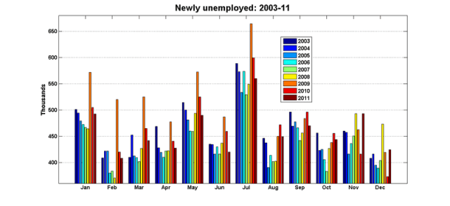
Here are the data for the newly-unemployed – those with durations of 4 weeks or less:
I've truncated the y-axis so that the changes during the recession are more visible, but the scale itself is pretty impressive. To put this in perspective, unemployment averaged about 1.2m a month during this period.
And here are the same data expressed as 12-month moving averages:
You can certainly see the recession in those two graphs – and you can also see that the increases came off a very low base. As we've come to realise, the pre-recession years were an exceptionally strong boom that put the recession in sharp relief.
The next step is to break out the components of the newly-unemployed. Here are the transitions from NLF to unemployment. These are fairly important, accounting for roughly half of the flows into unemployment:

and the 12-month moving averages:
I'm not sure what to make of this. You could tell a story about why there was a surge in LF entrants during the recession: when the main wage earners of households lose their jobs, other members of the household may obliged to seek employment. And you could tell a story about a surge in labour force entrants during the recovery (the obverse side of the discouraged worker phenomenon). But I'm not sure how to put together a story about LF entrants rising in 2008 and only starting to fall after the employment peak had been re-established. Maybe a combination of both stories?
The most interesting component of the newly-unemployed – at least, as far as tracking the business cycle goes – are the newly laid off. As was mentioned before, the layoff numbers in the US JOLTS data were fairly stable. But not, apparently, in Canada:
And the 12-month moving average:
You can see sharp spikes in layoffs starting in November 2008, and there were roughly an extra 60,000 layoffs in each of the first three months of 2009. But by September 2009, the flows of layoffs had returned to their usual levels.
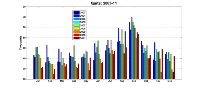
The last and smallest component of the newly-unemployed are those who quit their last job:
And the 12-month moving average:
This is remiscent of the US experience: quits fell by about one-third during the recession, and they have yet to recover their pre-recession levels.
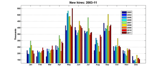
So much for the flows into unemployment. Here are the data for new hires – that is, those in employment reporting a job tenure of one month:
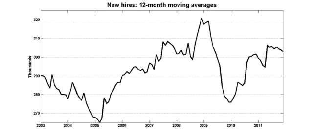
And the 12-month moving average:
You can pick out a drop in hiring during the recession, but it's not as dramatic as in the US – although the jump in hiring in 2006-08 may make it seem that way. Hiring rates fell to the levels we saw in 2004-05.
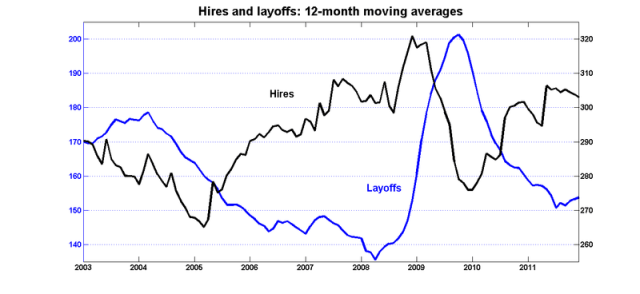
Here is a graph where I put the 12-month moving averages for both layoffs and hires. The axes are shifted, but they have the same scale:
You see an increase in layoffs and a drop in hires, but it looks to me as though swing in layoffs is the more important factor. Quite a different experience than in the US, where layoffs were stable and the drop in hiring drove employment losses.
After I gave my talk, Kevin Lang suggested that I (or someone) should re-do this exercise using data from the US Current Population Survey, and see how those numbers compare with the employer-based JOLTS data. It would be interesting to see how many separations are viewed as quits by employers and layoffs by workers (and vice-versa).
*I still can't believe that I – a macro time series econometrician – actually went to the public use microdata files for the Labour Force Survey to get these numbers.




Stephen;
Are the LFS data amenable to matching? I’ve used the CPS files to get some panel dimension on the respondents before. I feel like you must be matching, unless the LFS asks some fairly specific questions which you wouldn’t find in the American CPS.
No, you can’t track the same respondent from one month to the next using the public use files. Apparently you can with the master files. I’m getting my courage up to try and do that.
The story of the US recession was not one of mass layoffs; the flows of layoffs are fairly stable throughout.
Really? Are you sure you aren’t the victim of an optical illusion Nick? In the months from January 2007 through mid-2008, the monthly layoffs and discharges number appears to be around 2 million. But in the months right around January 2009, that number seems to go up to around 2.75 million to 3 million. A 40% to 50% uptick in dismissals seems to me to qualify as a mass layoff.
Also, those are the raw numbers. Since the workforce was shrinking, then even if the monthly layoff stayed constant, layoffs as a proportion of the labor force were rising dramatically.
Dan: that post was by Stephen, not me. (Stephen’s the one who is good with numbers and charts and graphs and things).
Stephen, there is a public use file for the SLID (survey of labour and income dynamics), which is the longitudinal LFS – that would allow you to track respondents. I haven’t used it, however. (Now back to marking).
Frances: I’ll take a look at that. Offhand, do you remember if SLID comes with weights that would give estimates of how many people experience a given transition in a given month?
Dan: You’re quite right – I was just eyeballing that JOLTS graph. But I just checked the raw numbers and yes, there was a jump in layoffs during roughly the same time as here. I’m going to do a follow-up post.
Is there any breakdown by occupation or sector?
Are any of these numbers linked to exports to America, e.g. timber products or transportation for export, etc.?
It’s possible, yes. Just a matter of taking the time to extract it.
I know that studying labour market transitions is old hat for for labour economists, but there seems to be business cycle aspects that are not well-understood.
Stephen: “Offhand, do you remember if SLID comes with weights that would give estimates of how many people experience a given transition in a given month?”
I’d be very surprised it if didn’t have weights, pretty much every PUMF that I’ve ever looked at does. Unfortunately, I don’t find them particularly easy to use, and whether or not they would be reliable enough to give good estimates of the number of transitions is another matter entirely. Kevin Milligan would be the person to ask on this. Typically I’ve seen SLID used for estimating the probability of an individual person experiencing a particular type of transition, e.g. hazard models for the probability of exiting unemployment.
Yes, I’ve seen lots of those sorts of studies. I just checked Equinox, and the latest SLID PUMF is only from 2006. Is that normal? Does it take that long for the files to be prepared?
Stephen, odesi, which is the Ontario University data portal, has up to 2009, and I’d be astonished if Laval didn’t have equally good access through the data liberation initiative.
I don’t think you’d be able to get SLID data that’s recent enough to look at, e.g., this year’s macro trends. There are huge confidentiality issues with longitudinal data so it takes a while to be cleaned up. Also the policies around release of longitudinal data seem to be a little inconsistent, e.g. the first three waves of the National Longitudinal Survey of Children and Youth are available, but later waves aren’t (it’s amazing how much I’ve learned in this year’s micro honours research seminar, 2 years ago I wouldn’t have been able to tell you any of this!)
Its so unsettling when the main wage earners of households lose their jobs, possibly meaning that the younger or older members of the household may need to look for work just to avoid getting into serious debt. Not a good situation.