Give an economist a problem such as "Why do people waste their time playing video games?" and she'll typically model it like this:
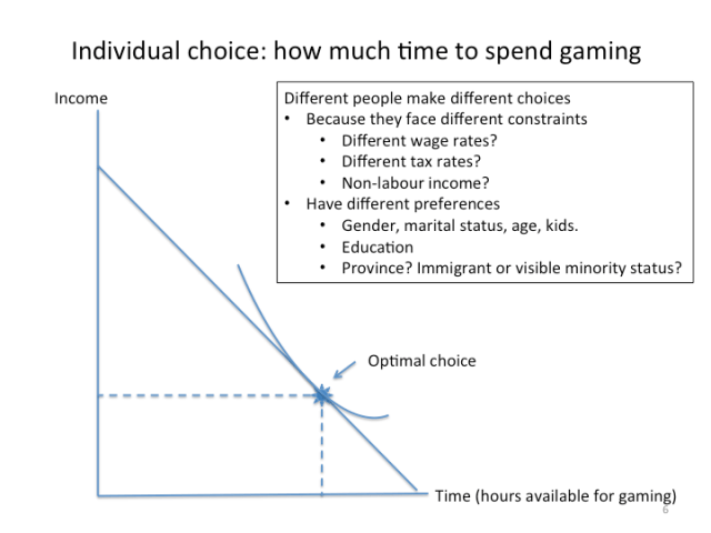
Assume that individual i has a utility function Ui that depends upon time spent gaming, tg, and income, Y:
Ui=Ui(tg, Y)
The individual is assumed to allocate all time available (T) to time spent gaming and time spent working (tw) so tg+tw=T. If the individual's wage rate is given by w and non-labour income is taken to be zero, utility maximization is subject to the budget constraint:
Y=w(T-tg)
Graphically, the individual's utility maximization problem can be represented as follows:
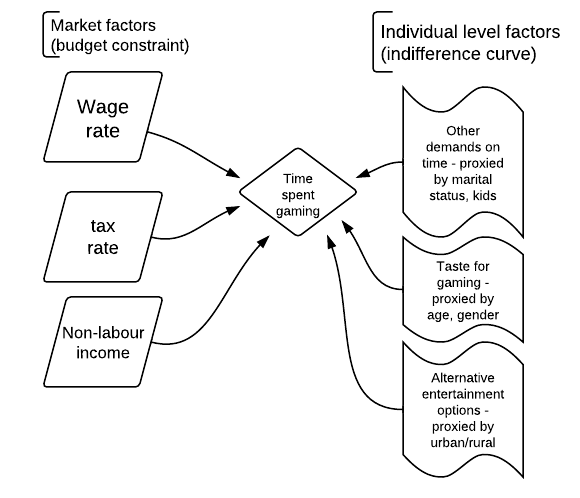
Now if someone from the business school was presented with the same problem, they would probably come up with some kind of flow chart, showing time spent gaming as the result of the interaction between market forces and individual preferences. It might looks something like this, only prettier:

I start twitching when I see someone throw up a flow chart and call it a model. Yet when it comes to empirical research, drawing pictures like the one above can be helpful.
The dependent variable (the left hand side variable, the thing to be explained) goes in the middle of the chart. The explanatory (right hand side, independent) variables go on one (or both) sides of the diagram.
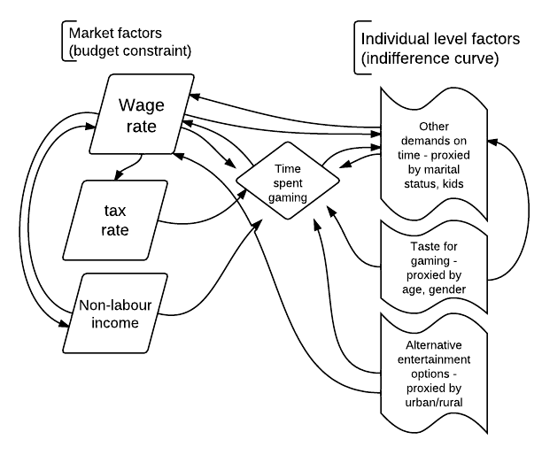
The first thing to think about is the relationship between the explanatory variables and the dependent variable. Does the arrow go one way – from the explanatory to the dependent – or both ways? Why?
The next step is to consider possible relationships between explanatory variables. Are the explanatory variables related to each other? Are there arrows between the various explanatory variables?
Adding in other possible causal relationships creates a diagram that looks something like this:
What can one when faced with the inherent complexity of the real world?
First, be careful about drawing conclusions. A lot of the time, the arrows go both ways. One might find, for example, that people with low wages spend more time playing video games. But does that mean low wages cause gaming or gaming causes low wages? It's impossible to tell.
Second, be extremely careful about model specification. Suppose, in the example above, someone ran a regression to explain time spent, but omitted "urban/rural" as an explanatory variable. Because urban/rural status is correlated with the wage rate, the wage rate variable will pick up some of the effect of the urban/rural status variable, if the later is omitted. It matters a lot which variables are included/excluded in a model, yet there are no simple rules for which variables to include/exclude.
Third, theory matters. I could throw the number of carrots eaten per week into a regression explaining time spent video gaming, and it might well come up as statistically significant. But just throwing in explanatory variables and seeing which one fits is a surefire way of picking up spurious relationships – patterns that exist in the data, but have no causal or other significance.
Finally, the rare and special variables are ones that only have arrows coming out of them – things like, in this example, age and gender. These are the variables that can – with luck – help identify causal relationships; the ones to treasure and savour.


It is nice when academics have some time to produce useful pieces like this. The underlying point is that many if not all of the variables that political policy wonks and talking heads usally say “prove” their point have arrows going in and out.
“I start twitching when I see someone throw up a flow chart and call it a model”
Why? Your third model is clearly a gazillion times better than your first (which is pretty similar to the second – or exactly similar for all practical purpose).
Whoa. No, it isn’t. A model isn’t better because it’s more complex and because its linkages are more opaque. A model that says “everything depends on everything” is essentially useless.
Models are only useful to the extent that they help the analyst understand what’s going on.
nemi – the second model is supposed to be basically the same as the first. The third model tells me that I have potential endogeneity problems – which I guess is good to know, but I might not be able to do anything about it, so do I run an OLS regression anyways or just give up?
Stephen, absolutely – the tricky thing is knowing which things to ignore and which ones to worry about.
Stephen Gordon – Engineers uses flowcharts models where “everything depends on everything” (this is just how the real world is…) and no, it’s not useless and they do help the analyst to understand what’s going on.
Mathieu – there’s a fundamental difference between the way that computer scientists (and perhaps engineers?) use flow charts and the way that they’re used in some social science research. (Actually, I think the one that I’ve drawn is more properly a data flow diagram ).
When flow charts are used to model a decision or a process, there is usually some inherent logical sequence that’s being modelled.
In the social sciences, one typically observes a state of the world, and it’s much harder to know what causes what. When one draws a flow chart, one can end up suggesting causal relationships that may or may not exist. At the same time, that’s what useful about them – standard econ modelling also presumes all sorts of causal relationships, but the causal assumptions are not always obvious to the average undergrad.
I think the argument that economics is different is a bit of a fob-off to justify sticking with static methods to model a dynamic system. The problems when trying to use flowcharts in economics comes from the reliance on microfundations when you actually need to be macrofunded. It’s like trying to model a brige by starting from the behaviour of elementary particles. If you look at Steve Keen’s models (which I think is undoubtly the best flowcharts models in economics), there’s a process implying a logical sequence that’s being modelled and the results can be tested against the datas in order to validate or invalidate.
Mathieu – interesting. A lot of Steve Keen’s material is behind a paywall, but from what I could download it seems like his is more macro – where circular flow models have a long and honoured history – than micro. I don’t know where else flow chart models are used in econ – I just googled flow chart economics and got a bunch of references to circular flow diagrams, and then this post came up as the #5 hit (google must know who/where I am).
“A model isn’t better because it’s more complex and because its linkages are more opaque.”
???
Of course complexity is not good in itself – but the third model is not (necessarily) complex.
It should be trivial to estimate with panel data and a system of simple linear equations.
And sure, I would drop a few of the arrows if i went on to estimate and implement the model. But they are good to have in the theoretical model.
nemi: “It should be trivial to estimate with panel data and a system of simple linear equations.”
And the public use panel data sets are…..? There are about three or so US panel data sets that are public use, aren’t there, but we have next to no public use ones in Canada (3 waves, I think, of the kids survey can be accessed from university libraries, but that’s about it, as far as I know), and the European ones can’t be accessed from over here.
If you want to see more on Keen’s models, here’s two presentation he gave at the fields institute last month.
http://www.debtdeflation.com/blogs/2012/06/17/fields-institute-presentation-series-video-1/
http://www.debtdeflation.com/blogs/2012/06/24/fields-institute-presentation-series-video-2/
And if you want to see how to build those models more in detail, here’s a set of university lectures freely available on youtube where he shows how to build simple models. You can start at the lecture on endogenous money if you don’t want to hear his complaints on neoclassical models…
I think in the real world you need both. “It matters a lot which variables are included/excluded in a model, yet there are no simple rules for which variables to include/exclude.”
The first model is the conclusion of the flow model with utility: U=f(t,Y) and the budget constraint: Y=f(t) is the practical conclusion of the data flow diagram. Your data flow diagram begins with U=f(time spent on Other, age, gender, alternative entertainment, and income) and Y=f(wages, taxes, non-labour income, time spent on other).
After some discusion about what is theoretically significant, all of the factors that contribute to Utility except game-playing and time are assumed to be constant and all of the factors that influence Income except time are assumed to be constant.
As for the arrows that go both ways, isn’t this where economists are supposed to shine? Both with theory and statistical tools?
As for the public use data sets – I thought the federal position was the private sector could collect all the data we needed to know more effeciently than StatsCan? (Personally I just happy that we can now access Cansim far more cheaply.)
“And the public use panel data sets are…..?”
True – but would you even try to answer the question about the casual relationship between “time spent gaming” and “wage” without one?
I would not – and if I only had to present a theoretical explanation, I certainly would not omit most of the arrows in the third model. Time spent gaming probably has an as big effect on wage as the wage has on the time spent gaming. I know of people who failed to get a college degree because of gaming (I shared a apartment with one of them). Likewise, I do know a lot of people (usually women) who dumped someone due to that persons gaming behavior (so, certainly, marital status is not even approximately exogenous). Etc.
A model should be as simple as possible, but not simpler
PS: you could of course try to use instrumental variables for the exogeneous explanatory variables, and if i got paid to do the study I would probably do that, but i would not belive the results.