“It is generally recognized that more saving takes place in communities in which the distribution of wealth is uneven than in those in which it approaches more closely to modern conceptions of what is just.” T.S. Ashton (1948) The Industrial Revolution 1760-1830, p. 7.
I came across this quote while reading Ashton’s account of the industrial revolution and was taken by this sweeping assertion especially in light of current public debate such as Obama’s State of the Union pledge to tackle inequality as well as research on economic inequality and how it is harming economic growth. If new investment and capital formation is a function of saving, then if inequality fosters greater saving, it should also play some role in fostering investment and economic growth.
Economists like Kuznets seemed to think that income inequality was associated with economic growth at least when economies were starting to develop – remember the Kuznet’s Curve? You can get a pretty good overview of the literature and the issues in Growth, Inequality and Globalization by Philippe Aghion and Jeffrey Williamson (2001). There is an argument that inequality is good for economic growth because it provides an incentive to get rich – I suppose this is Kevin O’Leary’s line in response to the recent report by Oxfam that 85 people control one half of the world’s wealth.
Yet, there is also the view that rising inequality can be bad for economic growth. See for example work by Jared Bernstein or this IMF report by Berg and Ostry. Whether inequality somehow undermines consumer spending or leads to under-investment in human capital that undermines economic growth is an empirical question. What is also an empirical question is whether there is more saving when there is greater economic inequality. T.S. Ashton certainly seemed to think so.
So, I got together some data on household saving rates, economic growth rates, and Gini coefficients for both disposable household income and household wealth for the OECD countries (sources below). The Gini coefficients for household income are for the late 2000s, the Gini coefficients for wealth are for the year 2000 and the household savings rates out of disposable income and real GDP growth rates are an average for the period 2001 to 2011. This data is difficult to get perfect time period correspondence for. Nevertheless, here are some plots. The results are interesting but not definitive in providing an answer. 
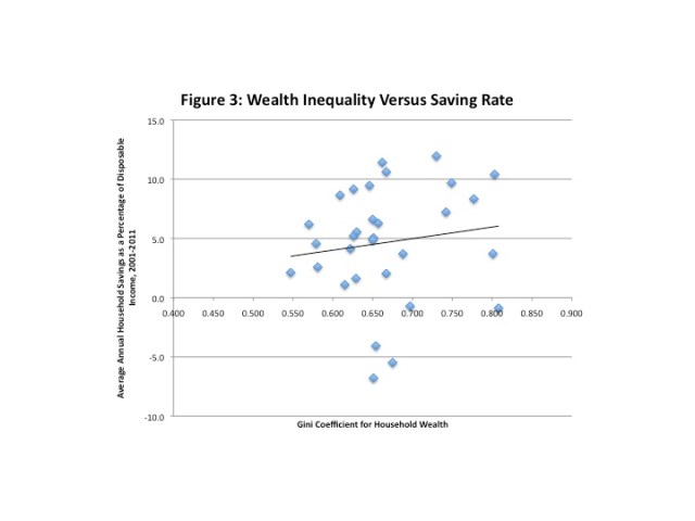
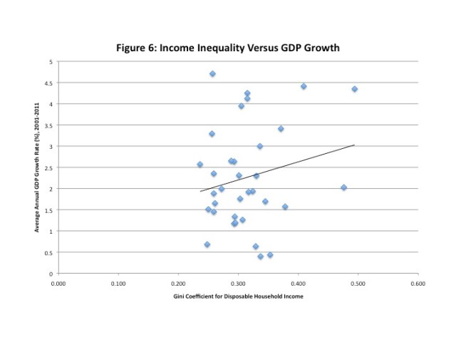
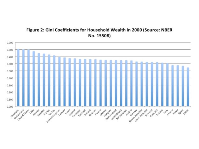
Figure 1 and 2 rank the Gini Coefficients for both household disposable income and household wealth for the OECD countries. Figures 3 and 4 plot the respect Gini coefficients for wealth and income against the average annual saving rate for the period 2001 to 2011. Figures 5 and 6 plot the Gini coefficients for wealth and income against the annual average GDP growth rate (real GDP) for that same period. 


The results for inequality by rank show that income inequality (Figure 1) was the highest in Chile and the lowest in Slovenia (Canada was 12th and the USA 4th). As for wealth inequality, it was the highest in Denmark and the lowest in Japan (with Canada ranked 10th and the United States 3rd). As is generally known, wealth is more concentrated than income. When wealth inequality is plotted against the saving rate (Figure 3) and a linear trend fitted, there is indeed a slight positive relationship but there is plenty of variation around the trend. There is even less of a fit when income inequality is plotted against the saving rate (Figure 4). As for economic growth, the relationship between wealth inequality and real GDP growth rates (Figure 5) is at best slightly negative. There is a more pronounced positive relationship between income inequality and economic growth (Figure 6).
Greater wealth inequality does appear to be associated with higher savings rates but greater income inequality does not appear to be very strongly related to savings rates. Wealth inequality does not appear to be positively related with GDP growth but higher income inequality appears to be positively related with higher GDP growth. Of course, these are only scatterplots and the results anything but definitive. There you have it.
Data Sources:
Household net saving as a percent of disposable income and GDP growth rates, average for period 2001 to 2011. Source: OECD National Accounts at a Glance 2013. http://dx.doi.org/10.1787/na_glance-2013-en
Gini Coefficient for disposable household income in late 2000s. Source: Table A1.1 Trends in different income inequality measures, An Overview of Growing Income Inequalities in OECD Countries: Main Findings 2011 http://www.oecd.org/els/social/inequality
Gini Coefficient for household wealth in 2000. Source: J. Davies, S. Sandstrom, A.B. Shorrocks, E.N. Wolff (2009) The Level and Distribution of Global Household Wealth, NBER Working Paper 15508.
// <![CDATA[
// <![CDATA[
// &lt;![CDATA[
// &amp;lt;![CDATA[
// &amp;amp;lt;![CDATA[
// &amp;amp;amp;lt;![CDATA[
// &amp;amp;amp;amp;lt;![CDATA[
// &amp;amp;amp;amp;amp;lt;![CDATA[
// &amp;amp;amp;amp;amp;amp;lt;![CDATA[
// &amp;amp;amp;amp;amp;amp;amp;lt;![CDATA[
// &amp;amp;amp;amp;amp;amp;amp;amp;lt;![CDATA[
// &amp;amp;amp;amp;amp;amp;amp;amp;amp;lt;![CDATA[
// &amp;amp;amp;amp;amp;amp;amp;amp;amp;amp;lt;![CDATA[
// &amp;amp;amp;amp;amp;amp;amp;amp;amp;amp;amp;lt;![CDATA[
var sc_project=9080807;
var sc_invisible=1;
var sc_security=&amp;amp;amp;amp;amp;amp;amp;amp;amp;amp;amp;quot;4a5335bf&amp;amp;amp;amp;amp;amp;amp;amp;amp;amp;amp;quot;;
var scJsHost = ((&amp;amp;amp;amp;amp;amp;amp;amp;amp;amp;amp;quot;https:&amp;amp;amp;amp;amp;amp;amp;amp;amp;amp;amp;quot; == document.location.protocol) ?
&amp;amp;amp;amp;amp;amp;amp;amp;amp;amp;amp;quot;https://secure.&amp;amp;amp;amp;amp;amp;amp;amp;amp;amp;amp;quot; : &amp;amp;amp;amp;amp;amp;amp;amp;amp;amp;amp;quot;http://www.&amp;amp;amp;amp;amp;amp;amp;amp;amp;amp;amp;quot;);
document.write(&amp;amp;amp;amp;amp;amp;amp;amp;amp;amp;amp;quot;&amp;amp;amp;amp;amp;amp;amp;amp;amp;amp;amp;lt;sc&amp;amp;amp;amp;amp;amp;amp;amp;amp;amp;amp;quot;+&amp;amp;amp;amp;amp;amp;amp;amp;amp;amp;amp;quot;ript type=&amp;amp;amp;amp;amp;amp;amp;amp;amp;amp;amp;#39;text/javascript&amp;amp;amp;amp;amp;amp;amp;amp;amp;amp;amp;#39; src=&amp;amp;amp;amp;amp;amp;amp;amp;amp;amp;amp;#39;&amp;amp;amp;amp;amp;amp;amp;amp;amp;amp;amp;quot; +
scJsHost+
&amp;amp;amp;amp;amp;amp;amp;amp;amp;amp;amp;quot;statcounter.com/counter/counter.js&amp;amp;amp;amp;amp;amp;amp;amp;amp;amp;amp;#39;&amp;amp;amp;amp;amp;amp;amp;amp;amp;amp;amp;gt;&amp;amp;amp;amp;amp;amp;amp;amp;amp;amp;amp;lt;/&amp;amp;amp;amp;amp;amp;amp;amp;amp;amp;amp;quot;+&amp;amp;amp;amp;amp;amp;amp;amp;amp;amp;amp;quot;script&amp;amp;amp;amp;amp;amp;amp;amp;amp;amp;amp;gt;&amp;amp;amp;amp;amp;amp;amp;amp;amp;amp;amp;quot;);
// ]]&amp;amp;amp;amp;amp;amp;amp;amp;amp;amp;amp;gt;
// ]]&amp;amp;amp;amp;amp;amp;amp;amp;amp;amp;gt;
// ]]&amp;amp;amp;amp;amp;amp;amp;amp;amp;gt;
// ]]&amp;amp;amp;amp;amp;amp;amp;amp;gt;
// ]]&amp;amp;amp;amp;amp;amp;amp;gt;
// ]]&amp;amp;amp;amp;amp;amp;gt;
// ]]&amp;amp;amp;amp;amp;gt;
// ]]&amp;amp;amp;amp;gt;
// ]]&amp;amp;amp;gt;
// ]]&amp;amp;gt;
// ]]&amp;gt;
// ]]&gt;
// ]]>
// ]]>


“…real GDP growth rates are an average for the period 2001 to 2011.”
There’s the rub. To make any sense out of this , you’d have to sort the data by countries that participated in the debt bubble fueled growth during this time span , versus those that did not (e.g., Germany ). Among those that did , you’d need to separate out those in which the bubble has collapsed from those in which it is still ongoing ( e.g. , Canada and Australia ).
“…but greater income inequality does not appear to be very strongly related to savings rates.”
In the largest, and by most accounts, best study to date on this question, by Schmidt-Hebbel and Serven (2000), involving World Bank data on 82 countries over 1965-1994, they generally found no significant correlation between measures of income inequality and aggregate savings.
The lone exception was in a regression that used the income share ratio of top 20% to bottom 40%. The correlation was significant at the 5% level, but was negative. In other words, it suggested that greater inequality resulted in lower aggregate savings.
http://www.sciencedirect.com/science/article/pii/S0304387800000638
Livio: Hmmm. Interesting. Good post.
@ Mark
I left some details on the Singapore FX rate regime on the other noise discussion.
@ Livio
you might want to change solvenia to Slovenia : – )
When I look at Fig.6 growth vs income inequality, I see the special case Chile, with a copper boom and pensions and a lot of other social goodies organized / saved for privately (The old Modigliani argument, that, [somehwat shortened] generous public pensions (at that time: Japan) reduce the need for saving).
Turkey (missing in Figure 4 ???) has its best years of government debt fueled growth behind it.
And taking just those 2 points out of, should reduce any spurious correlation to highly insignificant.
Same in Fig. 5: When you look at minimum wages / pensions in Denmark, you understand why many folks in Denmark see little need for accumulating wealth, therefore the “extreme inequality” of the distribution
I’m going to make the heroic assumption that the data do not take account of taxes.
@ Robert,
since they dont state it, it is neither an assumption, nor heroic : – )
but up to you to show the relevance
remark on Japan above: in the early 50ties Japan had very low public pensions and high saving rates
As far as I know capital gains are not part of the household disposable income, correct? However, looking at something like the Forbes 100 that is where their wealth is coming from. Leaving that out will not tell the whole picture, IMHO.
Marko:
I was concerned about the effects of the debt bubble but I did not think there was enough data to start separating out countries. I took the average for the 2001 to 2011 period to smooth out the effects of the bubble and downturn particularly with respect to GDP growth.
Mark:
Thanks for the reference.
Nick:
Thanks. Glad you found it interesting.
Genauer:
Thanks for catching “Solvenia”. Been corrected. Good points. In Figures 3 & 4, Turkey, Iceland and Israel are missing – no saving rate data was provided for any of the years from 2001 to 2011 for those countries.
Robert:
In the case of income, its household disposable income so its after taxes.
Odie:
Agreed info on capital gains would be useful in getting a more complete picture.
Odie,
The household net savings rate is computed as a percent of disposable income. More importantly, capital gains are not income derived from the production of new goods and services, and hence are not included in the system of national accounts.
Capital gains are largely a tax construct consisting of the nominal gains in asset values between asset transfers. In fact in 13 OECD countries there are little to no capital gains because in those countries capital gains are generally not taxed.
I think we should actually develop this into a social game, like economist’s scrabble.
Somebody proposes a dependency and its significance and the rest tries to shoot it down. Formal arguments against a certain outlier (“Greece”) give one point, knowledge of additional dependencies 2 points, screwing the whole dependence with statistics arguments 3 points.
And for every 5 points one gets a pint, which must be drunk immediately, to slow down the fastest, in order to keep the game interesting for the others : – )
A few more words to the Gini coefficient. It used to be (20 years ago) that Germany and the US were at the opposite ends of the distribution. That has narrowed, also most people claim, that the US has become more unequal, and we claim here, that practically nothing has changed.
When you look at the national income distributions, you will often find that the 10-14th percentile has half the median income, or hourly wage, or …., and the 90th twice.
How income in the lowest decile is acounted for, with EITC, food stamps, other non-monetary goodies, low price high quality health care, differs a lot from country and country. Or whether something is counted as a separate household.
In the upper extreme, nearly everything is recorded in the US, tax free interest on muni bonds, switching houses.
In Germany we converted the taxation of stocks to formally taxing capital gains only in 2008
I am pretty sure, that most of the differences between DE and US were in practice accounting differences. And those are the 2 countries I know a little more about. I believe, that other countries have other quirks.
A further practical question: in what year would you record a capital gain?
Example, you bought stock in 2003, made some nice paper gains until 2008, lost all of that on paper that year, just to be back this year, and finally sell something.
How would you put this into income accounting?
Genauer:
We’ll need a scorekeeper as well as prizes for the game! The pint sounds refreshing.
I realize that censoring observations is an undesirable thing to do. But just eyeballing Figure 6, it sure looks like removing three observations–the countries with the highest Gini coefficients–would considerably change the estimated regression line. Actually, just removing the country with the highest Gini would probably do that. If essentially all the “work” is being done by one observation, then there is probably a problem.
Donald:
If you do that, you are eliminating Chile, Turkey and Mexico. If you redraw and fit the trend, the new diagram resembles Figure 5 – a slight negative relationship between income inequality and GDP growth.
Livio,
The pint as a frequent and only prize would only be useful, if we would play that on a tablet in a pub. But how many people in your area do you know, who would enjoy this? I would just play with myself : – (
And the idea was born out of the frustration, that basically all analysis I have seen with such kind of data is contaminated heavily by outliers.
But it did give me the following idea,maybe more realistic and useful: (first draft of a proposal !!)
1. the Excel sheets from the OECD can be downloaded more easily from http://www.oecd.org/eco/outlook/economicoutlookannextables.htm
2. they promise a new version in 6 weeks (14th March 2014), and that should be much more clear, what the impact of the last crisis was, the latest projections for the coming years, check how they fiddled with the old data, and much more
3. we do the analysis in Excel 2003, something everybody should have (I have also a German 2007 version, and it still drives me crazy, to find the German words for certain functions)
4. And then we analyze together all we can extract out of it, check on each other’s ways to assess them, especially how to deal with what outliers, and why
a) certain techniques to be robust against specific start / stop years, and discussing them with others
b) how much results depend on these choices
c) enable non-linear, multiple regressions
d) learn, what additional data others get from what source (I strongly suspect, that e.g. analysis vs Gini depends a lot on who is taking it from what side)
5. I would be willing to put some prize money out there, to the hands of Livio, lets say 200 Euro, to be given as token prizes, maybe just by Livio, or some “comitee” Livio, Mark A Sadowski (he has become quite good in interpreting such data, possibly me, … who else? Menzie Chinn? Anybody chipping in?
6. The result would be, that we understand each other better, can learn from each other, and have all a powerful spreadsheet for subsequent years to interpret and follow up
7. what else, I forgot?
Genauer:
How about this? If you want to download that data when it comes out and put together an analysis and write it up (1,000 words or less plus a couple of tables and/or graphs – let us say a max of six tables and graphs combined) I would be happy to publish it on WCI as a guest post. The wealth and income Gini numbers I used are below. I can email them to you in a spreadsheet if you like – you can get my email at:
https://www.lakeheadu.ca/academics/departments/economics/people. Cheers. Livio.
OECD Country/Income Gini
Australia 0.336
Austria 0.261
Belgium 0.259
Canada 0.324
Chile 0.494
Czech Republic 0.256
Denmark 0.248
Estonia 0.315
Finland 0.259
France 0.293
Germany 0.295
Greece 0.307
Hungary 0.272
Iceland 0.301
Ireland 0.293
Israel 0.371
Italy 0.337
Japan 0.329
Korea 0.315
Luxembourg 0.288
Mexico 0.476
Netherlands 0.294
New Zealand 0.330
Norway 0.250
Poland 0.305
Portugal 0.353
Slovak Republic 0.257
Slovenia 0.236
Spain 0.317
Sweden 0.259
Switzerland 0.303
Turkey 0.409
United Kingdom 0.345
United States 0.378
OECD Country/Wealth Gini
Australia 0.622
Austria 0.646
Belgium 0.662
Canada 0.688
Chile 0.777
Czech Republic 0.626
Denmark 0.808
Estonia 0.675
Finland 0.615
France 0.730
Germany 0.667
Greece 0.654
Hungary 0.651
Iceland 0.664
Ireland 0.581
Israel 0.677
Italy 0.609
Japan 0.547
Korea 0.579
Luxembourg 0.650
Mexico 0.749
Netherlands 0.650
New Zealand 0.651
Norway 0.630
Poland 0.657
Portugal 0.667
Slovak Republic 0.629
Slovenia 0.626
Spain 0.570
Sweden 0.742
Switzerland 0.803
Turkey 0.718
United Kingdom 0.697
United States 0.801
What about weighing the data? Can we really put DK and US as equivalent points?
Jacques:
Should we weight by population or GDP?
Ideally, we check by both and see what stick. We could also try GDP/cap to see if there is an effect.
Given the size of the US, you could then just leave out all the smaller ones
If the problem is that rising inequality is due to ever increasing rent-seeking schemes by those at the top of the income pyramid (and I thing that’s the usual argument), then I’m not sure we should be surprised that regressing GDP growth on income inequality shows a positive relationship. If the real problem is rent-seeking, then we shouldn’t trust the GDP growth numbers because what is getting picked up as increased productivity is actually just consumer surplus going to fat cats. Do we really believe that the financial services sector is adding as much value to the economy as the NIPA tables suggest? Want to buy a bridge in Alaska?
Very interesting post.
Are there any studies that shows a strong correlation between GDP growth and any income metrics? To counter/aupport the claim that growth is greater with more poor (who are incentivized to work hard), it would be interesting to look at income decile mobility from lower deciles to higher ones.
Do you have the R-squared statistic for figures 3 to 6? The scatter graphs do not suggest linear regression as the correct method to use.
I would be very surprised if the data (especially on wealth) was even remotely accurate.
I don’t think it requires data to know that if the economic reward for working hard is nothing, then people will not work hard.
@D. Tohmatsu:
On 2.: On the contrary I think it does requires data. Because some research says beyond a certain number raising the economic compensation does not increase motivation.
So there are some other forces motivating people to work hard, besides economic reward.
Denmark has the highest wealth inequality, low savings rate, and low GDP growth. So?
Perfect !
Can anybody tell me anything which would be wrong with Denmark?
“If new investment and capital formation is a function of saving, then if inequality fosters greater saving, it should also play some role in fostering investment and economic growth.”
Keynesians see an increase in savings as bad for economic growth if it’s coming from less consumption which also then hurts companies’ ability to invest more.
Some Keynesias also don’t believe that all money saved today will be invested or spent tomorrow